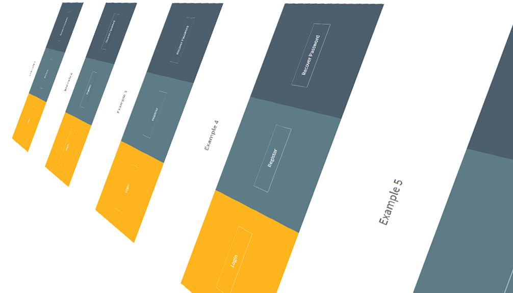
I have created 30 CSS button hover effects that uses only CSS for the animation. In this tutorial I will only explain how the sixth example works. You can view the code for the rest of the buttons by downloading the source code.
Be careful not to ruin your website design and make sure you are using the buttons that fit your design the most. Some of the effects are quite, let's call them 'dramatic' and those effects may be suited for a page where you only have 1 button or just a few.
The animations are very easy to customize since they are made out of just CSS. Let's get started explaining the sixth example.
HTML
Let's make the first button of the sixth example.
<div class="wrapper-inner-tab-backgrounds-first">
<div class="sim-button button6">
<span>Login</span>
</div>
</div>
Inside the '.button6' class the text is wrapped in a span. The span is essential for the effect to work properly.
CSS
First we have to create the usual set of styles for a button. One important thing is the relative position which will help to hold the other elements.
.button6{
	color: rgba(255,255,255,1);
	-webkit-transition: all 0.5s;
	-moz-transition: all 0.5s;
	-o-transition: all 0.5s;
	transition: all 0.5s;
	border: 1px solid rgba(255,255,255,0.5);
	position: relative;
}
.button6 a{
	color: rgba(51,51,51,1);
	text-decoration: none;
	display: block;
}
The span has an absolute position because i want the text inside the button to float above the next element.
.button6 span{
	z-index: 2;
	display: block;
	position: absolute;
	width: 100%;
	height: 100%;
}
I have created a 'before' selector this will be the element that generates the effect. The element will have an absolute position, an initial size of half of the total size and the opacity set to 0. We will create the effect by making the element scale to the full size and setting the opacity to 100%.
.button6::before{
	content: '';
	position: absolute;
	top: 0;
	left: 0;
	width: 100%;
	height: 100%;
	z-index: 1;
	opacity: 0;
	background-color: rgba(255,255,255,0.5);
	-webkit-transition: all 0.4s;
	-moz-transition: all 0.4s;
	-o-transition: all 0.4s;
	transition: all 0.4s;
	-webkit-transform: scale(0.5, 1);
	transform: scale(0.5, 1);
}
.button6:hover::before{
	opacity: 1;
	-webkit-transform: scale(1, 1);
	transform: scale(1, 1);
}

