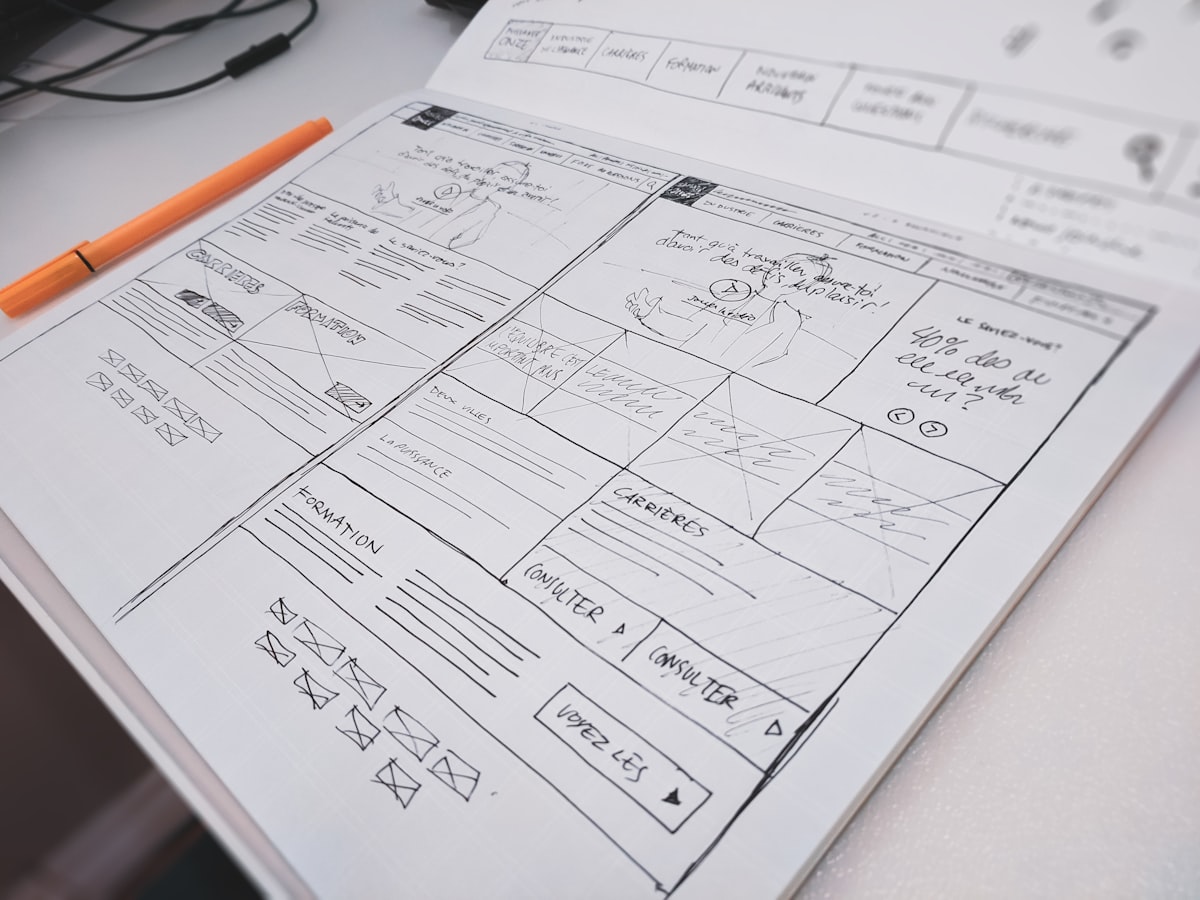
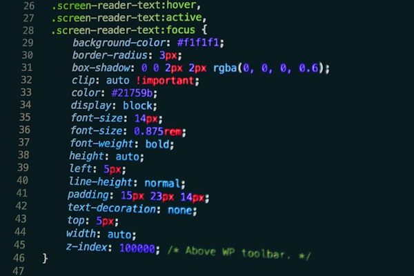
Welcome, fellow web design adventurers! You've stumbled upon the magical realm of CSS Media Queries – a mystical land where pixels bend to your will, screen sizes cower before your might, and the responsive design becomes your loyal steed. Think of media queries as your digital "Honey, I Shrunk the Kids" machine, except you're resizing websites, not your offspring!
1. Introduction to CSS Media Queries: What are They and Why are They Important?
Now, let's unravel the enigma that is CSS Media Queries. If CSS were a superhero team (like the Avengers or the Justice League, you pick!), Media Queries would be their shape-shifting member, always ready to adapt and respond. Media Queries allow your website to look fabulous, dahling, on any device, be it a puny smartphone or a gargantuan 4K monitor.
So, why are these media queries so crucial, you ask? Well, dear reader, as we steadily march into the future, screen sizes are multiplying faster than rabbits in springtime. Your website, which looks splendid on your computer, might look like it partied a bit too hard on a smartphone. The solution? Media queries! They ensure that no matter what device your user is on, your site maintains its composure and style. In essence, they are the gatekeepers of the responsive design realm.
Just remember, with great power comes great... fun! Let's dive deeper into the eccentric world of CSS Media Queries and turn you into a responsive design wizard!
2. Understanding the Basic Syntax of CSS Media Queries
Ready to crack the code of CSS Media Queries? Excellent! Buckle up, dear reader, because we are about to embark on a thrilling rollercoaster ride through the wonderland of syntax and curly braces. Don't worry - you won't need any cryptographer's training for this. Just a sprinkle of curiosity and a dash of patience!
In the simplest terms, a media query is a CSS technique that applies certain styles based on specific conditions. It's like a digital chameleon that changes its outfit according to the weather, or rather, the browser window. The syntax, while looking as complex as a Starbucks order, is actually quite friendly once you get to know it.
Behold the basic structure of a CSS Media Query:
@media media-type and (media-feature) {
    /* Insert dazzling CSS styles here */
}
In this snippet, the @media is the secret handshake that lets the browser know a media query is about to drop. Following this, media-type is the general category of device you're targeting (such as screen or print), and media-feature is the specific characteristic (like min-width or max-height).
For instance, if you want your website's layout to change when the browser window is less than 600px wide (the point where your site starts to look like it's trying to squeeze into skinny jeans), your media query would look something like this:
@media screen and (max-width: 600px) {
    /* Your snazzy CSS styles for smaller screens go here */
}
Voila! You've just written a media query! This little code snippet is your golden ticket to the responsive design carnival. It's the key to making your website look equally stunning on all devices, from the beefiest desktop to the tiniest smartphone.
Now, with the basics in your web design tool belt, it's time to explore further. Prepare to conquer widths, heights, and orientations! Let's continue our expedition into the wild and wondrous world of CSS Media Queries. Onwards!
3. Key Components of CSS Media Queries: Width, Height and Orientation
Welcome, brave explorer, to the heart of the CSS Media Queries jungle! Here, amidst the tangled vines of code, you'll encounter the Big Three – Width, Height, and Orientation. Together, these titans control how your website adapts to different devices. They're like the traffic lights of web design, guiding your styles safely through the bustling streets of the Internet.
Width and Height: These two are the dynamic duo of dimensions, the yin and yang of your layout's adaptability. They come in two flavours: min-width/min-height and max-width/max-height. Think of them as your website's personal trainers, helping it stretch and shrink to fit any screen size. Use these properties to set the minimum or maximum viewport sizes at which your styles apply. For instance, to change the layout for screens wider than 768 pixels, your media query might look something like this:
@media screen and (min-width: 768px) {
    /* Your breathtaking CSS styles for wider screens go here */
}
Orientation: Welcome to the digital yoga class! Here, your website learns to gracefully transition between landscape and portrait modes. This media feature is all about whether the viewport is wider (landscape) or taller (portrait). Your website, much like a skilled yogi, can use this feature to smoothly adjust its pose (layout, in this case) based on the device's stance. Check out this nifty example:
@media screen and (orientation: landscape) {
    /* Your elegant CSS styles for landscape mode go here */
}
These three key components are your trusty allies in the quest for responsive design. With their help, your website can morph and adapt to any screen, like a digital chameleon on a multi-device safari!
So, grab your coding whip and your explorer's hat! It's time to dive deeper into the adventurous world of CSS Media Queries. Unleash your inner Indiana Jones and let's continue this exciting journey!
4. Responsive Web Design: The Role of CSS Media Queries
As we continue our journey through the labyrinth of CSS Media Queries, let's pause for a moment and consider their role in the grand scheme of web design. Think of media queries as the puppeteers of your website, gracefully pulling the strings to make it dance and twirl to the tune of different devices.
Responsive web design is not a mere trend; it's the very ethos of the modern web. It's about ensuring that your digital masterpiece looks as stunning on a smartphone as it does on a cinema display. That's where our trusty sidekick, CSS Media Queries, steps in!
Media queries are the secret sauce that adds zing to your responsive designs. They allow your website to respond to the user's behaviour and environment based on screen size, platform, and orientation. It's like having a personal stylist who ensures your site is always dressed to impress, no matter the occasion or the device.
Remember our friends Width, Height, and Orientation? With their help, CSS Media Queries can adjust your site's layout, making sure it fits snugly on any screen. You can switch between multi-column layouts for desktops and single-column layouts for mobiles, all with a few elegant lines of CSS.
In essence, CSS Media Queries are the digital tailors of the internet, measuring, cutting, and sewing your website's layout to ensure a perfect fit. They make sure your site is always the belle of the ball, no matter where it's viewed.
So, ready to harness the power of CSS Media Queries and weave some responsive magic? Let's continue this thrilling adventure! Buckle up, because next, we're diving headfirst into creating a mobile-first design with CSS Media Queries! Onward, fellow adventurer!
5. Creating a Mobile-First Design with CSS Media Queries
Prepare to set sail on the high seas of mobile-first design. In these digital waters, we prioritise pint-sized screens, ensuring our website shines on smartphones before we even think about desktops. It's a bit like preparing a miniature model before building the full-sized mansion. This strategy is known as "Mobile-First Design," and CSS Media Queries are the wind in our sails.
Why Mobile-First, you ask? Well, in this wild, mobile-dominated era, more folks are browsing the web on their smartphones than on their desktops. They're shopping, learning, and even finding love on these pocket-sized devices. It's only fair we give these small screens the first-class treatment they deserve!
Creating a mobile-first design with CSS Media Queries is like making a magic potion. We start with a base concoction (the styles for mobile screens), and then, as the screen gets bigger, we add ingredients (more styles) to transform the potion (our website).
Here's a sneak peek into the wizardry involved:
body {
    /* Basic styles that apply to all devices */
}

@media screen and (min-width: 600px) {
    /* Additional styles for devices that are at least 600px wide (tablets, perhaps?) */
}

@media screen and (min-width: 992px) {
    /* Even more styles for devices that are at least 992px wide (hello, desktops!) */
}
With this approach, we start with the smallest device in mind and progressively enhance the design for larger devices. It's like building a LEGO masterpiece, starting with the base and adding more blocks as we go.
So, are you ready to embrace the mobile-first ethos and create responsive designs that make every pixel count, no matter the device? Excellent! Let's continue our journey through the captivating world of CSS Media Queries. Hoist the main sail, it's full speed ahead!
6. Step-by-Step: Writing Your First CSS Media Query
Welcome, courageous code warrior, to the thrilling dojo of CSS Media Queries! Now that we've explored the theory, it's time to get our hands dirty. Or, well, our screens. Don't worry, though, there's no actual dirt involved - just some delightful lines of code.
Writing your first media query can feel like scaling a daunting code mountain. But fear not! I'll be your trusty sherpa guiding you each step of the way. So, gather your courage, fasten your metaphorical harness, and let's start this climb!
Step 1: Identify the Breakpoint: Start by determining the screen size at which your site begins to look a bit... funky. This screen width is your breakpoint, the magical number where your design transforms. You can use a tool like a browser's developer tools to help you identify this.
Step 2: Write the Basic Query Structure: Once you have your breakpoint, it's time to create the basic structure of your media query. Remember the secret handshake? Let's summon it:
@media screen and (min-width: 600px) {
    /* We'll add our fancy styles in here soon */
}
In this example, we're telling the browser to apply certain styles when the viewport is at least 600px wide.
Step 3: Add Your Styles: Now comes the fun part - deciding how your site should look on larger screens! Want to change the color of your headers? Adjust the layout? The world is your CSS oyster! Here's an example:
@media screen and (min-width: 600px) {
    h1 {
        color: hotpink;
    }
    /* Yes, our headers will be hotpink on screens wider than 600px! */
}
Step 4: Test, Test, Test!: Now, summon your inner detective and test your media query. Resize your browser window to see if your styles apply at the right time. If your headers turn a fabulous shade of hotpink at 600px wide, congratulations! You've written your first media query!
There you have it, brave coder! You've scaled the mountain and written your first CSS Media Query. Bask in the glory of your achievement! But don't rest on your laurels just yet; we've got more ground to cover. Let's venture forth!
7. Testing and Debugging CSS Media Queries: Essential Tools and Techniques
Our journey through the captivating world of CSS Media Queries continues, but with a twist. Now, we don the hat of a digital detective, diving into the art of testing and debugging. It's a bit like being Sherlock Holmes, but instead of solving crimes, we'll be resolving CSS conundrums!
Let's face it, even the best of us make mistakes. Maybe your media query isn't firing at the right time, or perhaps it's not firing at all. But fear not! With the right tools and techniques, you can become a master bug-squasher.
1. The Inspector Tool: This nifty feature in most browsers (like Chrome, Firefox, and Safari) is your personal magnifying glass. It allows you to peek under the hood of your website and see how your CSS rules are being applied. You can even tweak your styles live and see the changes in real-time!
2. The Device Toolbar: Another gem in your browser's developer tools, the Device Toolbar (also known as Responsive Design Mode in Firefox) lets you simulate different screen sizes and orientations right on your desktop. It's like having a whole gadget store at your fingertips!
3. Validate Your Code: Websites like Jigsaw (W3C CSS Validation Service) are like your personal grammar check. They'll scan your CSS and flag any errors or potential issues. Remember, even a misplaced semicolon can throw a wrench in your media queries!
4. Console Warnings: Keep an eye on your browser console. It's like the dashboard of your car, signalling when something goes wrong. Any errors related to your media queries will show up here.
5. The Old-fashioned Way - Trial and Error: Sometimes, the best way to debug is the good old process of elimination. If a media query isn't working, try commenting out your styles one by one to identify the culprit.
Remember, debugging isn't a chore - it's a challenge! It sharpens your skills, makes you a better coder, and hey, there's nothing quite like the joy of squashing a particularly pesky bug. So, embrace your inner detective and let's continue our thrilling adventure through the realm of CSS Media Queries!
8. Tips and Tricks for Optimizing CSS Media Queries
You've journeyed far in the land of CSS Media Queries, mastering syntax, designing responsively, and even debugging like a pro. But every adventurer knows there's always more to discover. So, fasten your coding seatbelt and prepare for a turbo-charged tour of my favourite tips and tricks for optimising CSS Media Queries!
1. Embrace the Mobile-First Approach: You've heard it before, and I'll say it again - start with styles for smaller screens, then progressively enhance for larger ones. It's not just good practice; it can also help reduce the amount of CSS you need to write. Efficiency for the win!
2. Group Related Styles Together: Instead of scattering media queries throughout your stylesheet, group them together for better readability. Your future self (and any other developers who might work with your code) will thank you.
3. Use Logical Operators Wisely: Did you know that you can combine media queries using logical operators like 'and', 'not', and 'only'? They're like the conjunctions of the CSS world, helping you craft more specific conditions.
4. Know Your Breakpoints: Breakpoints are not one-size-fits-all. They should be based on your content, not on specific devices. A great way to find the perfect breakpoints is by resizing your browser window until your layout starts to break, then voilà - you've found your breakpoint!
5. Avoid Overcomplicating: Keep your media queries as simple and clear as possible. You're not writing a mystery novel; you want anyone reading your code to understand it quickly.
6. Use REMs for Flexible Sizing: When defining sizes in your media queries, consider using REMs instead of pixels. They're based on the root font-size, which makes your designs more adaptable and accessible.
7. Test, Test, Test!: Finally, always remember to test your media queries on actual devices whenever possible. Simulators are great, but nothing beats the real deal.
Armed with these tips and tricks, you're ready to take your CSS Media Queries to the next level. So, hold your coding wand high, and let's continue our magical journey through the enchanting world of responsive design. Onwards!
9. Common Challenges and Solutions in CSS Media Queries
As we tread further on the winding path of CSS Media Queries, it's time to face the dragons - the challenges that occasionally rear their fiery heads. But fear not! With the right techniques and a bit of courage, these dragons can be tamed. Let's unsheathe our coding swords and tackle some common CSS Media Query challenges!
1. Overlapping Media Queries: It's a common tale - two media queries clashing like rival clans, causing unwanted side effects. The solution? Ensure your media queries don't overlap, or if they do, understand that the last rule defined will take precedence.
2. Ignored Styles: Ever felt like your media queries are ignoring you? If your styles aren't being applied, it might be due to specificity wars. CSS has a hierarchy, and sometimes, a style declared elsewhere can override your media query. The fix? Try to increase the specificity of your selectors or refactor your CSS to avoid conflicts.
3. Misunderstanding Viewport Sizes: Ah, the classic mix-up between device and viewport size! Remember, media queries react to the viewport size, not the device size. So always test your designs by resizing the browser window, not just by switching between devices.
4. Device-Dependent Breakpoints: Basing breakpoints on popular devices might seem wise, but devices and screen sizes are constantly changing. The solution? Base your breakpoints on your content, not devices. When your layout starts to look awkward, that's a good time for a breakpoint.
5. Too Many Media Queries: Just as too many cooks spoil the broth, too many media queries can make your CSS a hot mess. Try to keep your media queries to a minimum, and remember that sometimes, a little flexibility in your design can reduce the need for extra breakpoints.
Remember, brave knight, challenges are just opportunities in disguise. By facing these common CSS Media Query dragons, you'll emerge a stronger, more skilled coder, ready to tackle any coding quest that comes your way. So, brandish your coding shield, and let's march onwards in our adventure!
10. Real-World Examples of CSS Media Queries in Action
You've studied the map, learned the techniques, and battled the dragons. Now, it's time to see some treasure - real-world examples of CSS Media Queries in action. These shining beacons of responsive design will inspire you, showing how theory translates into practice. It's a bit like stepping into a museum, but instead of ancient artefacts, we're admiring modern masterpieces of code!
1. The Responsive Grid: Ever wondered how websites manage those neat, adjustable grids? The secret lies in CSS Media Queries. By adjusting the width and arrangement of elements at different breakpoints, websites can create a fluid grid that looks great on any device. Check out Bootstrap's Grid System for a prime example.
2. The Collapsing Menu: Many websites, like The New York Times, use media queries to switch from a full navigation bar on desktop to a hamburger menu on mobile. It's a smart way to keep navigation user-friendly, no matter the screen size.
3. The Multi-Column Layout: Websites like Medium use media queries to adjust the number of columns in their layout. On a wide screen, you might see a main content area and several sidebars, but on a mobile device, everything stacks neatly into a single column.
4. The Adaptive Images: Ever noticed how images on a website resize to fit your screen? That's the magic of CSS Media Queries at work. Sites like Unsplash ensure their stunning photos look fantastic on screens of all sizes.
5. The Font Size Adjustments: Some websites use media queries to adjust font sizes on different devices, ensuring text is always easy to read. Take a peek at Smashing Magazine, who have mastered the art of responsive typography.
These real-world examples are proof of the potent magic of CSS Media Queries. They show how with a dash of creativity and a good grasp of media queries, you can create a website that is a joy to navigate, no matter the device. So, keep these examples in your inspiration vault, and let's continue our journey through the thrilling realm of responsive design!
11. The Future of Responsive Design: Beyond CSS Media Queries
We've journeyed far and wide across the landscape of CSS Media Queries, but now it's time to glimpse into the future. Let's hop into our digital DeLorean and explore the thrilling possibilities of responsive design beyond CSS Media Queries.
1. Container Queries: Imagine if your elements could respond to their parent container's size, not just the viewport's. That's the promise of container queries, a feature currently under discussion by the CSS Working Group. This could revolutionise responsive design, offering even more granular control over how components behave at different sizes.
2. Intrinsic Web Design: Coined by Jen Simmons, intrinsic web design is a new approach that combines flexible grids, flexible images, and media queries to create more dynamic, responsive layouts. It's like building with a set of infinitely adaptable digital Legos!
3. The Role of AI: Artificial Intelligence is making waves in every field, and web design is no exception. Imagine AI-powered tools that could automatically adjust your design for different devices, or even personalise it for individual users. Sounds like science fiction, but it could be closer than we think!
4. Accessibility-First Design: As we look to the future, it's clear that accessibility needs to take center stage. This means using media queries not just to adapt to different screen sizes, but also to different user needs, such as preferring reduced motion or needing larger text.
5. More Advanced Browsers: As browsers become more advanced, they'll support even more powerful CSS features. Who knows what new media queries we'll have at our disposal in a few years?
The future of responsive design is bright and full of exciting possibilities. While CSS Media Queries will undoubtedly remain a key tool, they'll be part of a broader toolkit, helping us create even more flexible, accessible, and user-friendly designs. So, buckle up, and let's continue our journey, boldly coding where no one has coded before!
12. Conclusion: How to Continuously Improve Your CSS Media Queries Skills
You've traversed the intricate terrain of CSS Media Queries, learned new techniques, faced down challenges, and peered into the future. As our journey comes to a close, you might be wondering, "What's next?" Well, my friend, the world of web design is like a never-ending quest - there's always more to learn and improve. So, let's discuss how you can continuously hone your CSS Media Queries skills.
1. Practice Makes Perfect: Coding is like playing an instrument - the more you practice, the better you get. Try using media queries in your projects, experiment with different techniques, and don't be afraid to make mistakes. That's how we learn!
2. Stay Curious: The world of web design is always evolving, and staying up-to-date with the latest trends and techniques is crucial. Follow industry leaders, subscribe to web design blogs, and don't forget to check the Mozilla Developer Network (MDN) for the latest on CSS Media Queries.
3. Share Your Knowledge: They say the best way to learn is to teach. Consider sharing what you've learned about CSS Media Queries with others - through blog posts, tutorials, or even a talk at a local meetup. You'll reinforce your own understanding and help others on their journey.
4. Learn from the Best: Study the websites you admire. Use your browser's inspect tool to see how they've implemented their media queries. You'll likely pick up some clever tricks and techniques.
5. Embrace Feedback: Ask others to review your code. They might spot things you missed or offer a fresh perspective. Remember, every piece of feedback is a stepping stone to improvement.
6. Never Stop Exploring: Finally, always keep exploring. Try out new ideas, push the boundaries, and don't be afraid to think outside the box. That's how innovation happens!
In the world of CSS Media Queries, you're now a seasoned traveler. But remember, the journey doesn't end here. With every line of code, you're crafting digital experiences, making the web a more accessible place, one media query at a time. So, keep that coding spark alive, and let's meet again on another coding adventure!


