1. Revolutionize Your Code: Embracing the Future with CSS Variables
Ah, CSS Variables. Imagine if your wardrobe could magically adjust to the weather without you moving a single hanger. That’s CSS Variables for you — the stylist of the web. They’re like little buckets of style that you can pass around your stylesheet, splashing color and size wherever you fancy, all without replicating your code. In the bygone era, CSS was a game of constant repetition, like a parrot that’s learned only one line. But hark! The future is here.
With CSS Variables, also known by their fancier title, “Custom Properties,” you can effortlessly alter your design with a flick of a digital wand. Picture this: a single variable change and your website switches from day mode to night mode faster than you can say “dark theme.” It’s not just a time-saver; it’s a sanity-saver. You update one variable, and the rest of the site falls in line like well-behaved ducklings following their mother.
And here’s the kicker: they’re incredibly easy to implement. Define a variable like --main-color and use it throughout your stylesheet. Decided that #FF6347 (a delightful tomato, if you ask me) is no longer your jam? No problemo. Update it in one place, and watch the cascade of change flow through your site like a river of digital obedience.
So, leap aboard the variable train and watch as your code becomes as flexible as a gymnast with zero commitment issues. You’ll be creating more maintainable, scalable, and downright delightful web designs. CSS Variables are not just a best practice for 2023; they’re a manifesto for marvelous maintenance and spectacular scalability. It’s time to variable-ize your virtual vistas!
2. Media Queries Magic: Crafting Responsive Designs for Every Device
Step right up to the enchanting world of Media Queries, where the potions of responsiveness are brewed! In the grand circus of web design, your website must perform like a seasoned acrobat, seamlessly flipping and twisting across devices of all shapes and sizes. Enter Media Queries, the wizards behind the curtain, making sure your site doesn’t tumble when jumping from the colossal desktop trapeze to the tightrope of a smartphone.
This is not your average hocus-pocus; it’s a calculated charm of precision. With the flourish of a Media Query, your CSS can target specific conditions like width, height, and even pixel density. Are your paragraphs sprawling like a lazy cat on a tablet? A pinch of Media Query magic can tame them into purring contentment. Is your menu sprawling like a banquet table on a phone? Presto change-o, it transforms into a neat little hamburger – no grill required.
But why stop at mere transformation? Media Queries allow you to choreograph a ballet of boxes and texts, ensuring your website doesn’t just fit on every device, it looks like it was born there. They’re the digital tailor, taking measurements and stitching together a garment that fits your site like a glove – if gloves were responsive and made of pixels, that is.
Using Media Queries is like having a crystal ball; you anticipate the needs of your users and the quirks of their devices, then prestidigitate a layout that’s as fluid as a potion. The trick is to use them wisely — overuse can lead to a spell of confusion, and no one enjoys a cluttered incantation.
So, sprinkle the fairy dust of Media Queries across your stylesheet, and watch the magic unfold. Your site will transition with the grace of an enchanted forest, adaptable and prepared for the ever-shifting digital landscape. Responsive design isn’t just a trend; it’s an essential spell in your web wizardry kit for 2023.
3. The Zen of Clean CSS: Writing Maintainable and Scalable Code
In the serene garden of web development, Clean CSS sits like a Zen master awaiting its disciples. For those seeking enlightenment in maintainability and scalability, behold the minimalist beauty of Clean CSS. It’s about writing code as crisp as the morning breeze and as structured as a bonsai tree.
Clean CSS is not just about scrubbing away the dirt; it’s about finding the essence of what you need—no more, no less. It’s the art of “less is more,” or as the Zen masters call it, the practice of simplicity. This doctrine encourages using shorthand properties, embracing the cascade, and being intentional with your selectors—select them like you would pick a pebble for skimming, with purpose and precision.
The path to Clean CSS is paved with the pebbles of good practices. Comment like a poet, making every character count. Group similar properties and factor out commonalities like a gardener pruning a tree, encouraging growth in the right direction. And name your classes with a system as methodical as a librarian cataloging ancient wisdom.
In this digital dojo, we also practice the martial art of OOCSS (Object-Oriented CSS), where we compartmentalize the styles into reusable objects—like a kitchen stocked with multi-use ingredients, ready to whip up whatever dish the palate desires. By decoupling structure from skin, and container from content, your CSS becomes a flowing robe, adaptable and unfettered by tight knots.
As you cultivate the Zen garden of your stylesheet, each line of code should pass the scrutiny of a meditative review. Are you writing CSS that speaks to the future, or will it become the tangled underbrush of yesteryear? Aim for code that flows like water, easily accommodating the stones of new content and features that may come to rest in its bed.
Remember, the journey to Clean CSS is a continuous path of refinement. With each iteration, you come closer to achieving CSS Nirvana—where maintenance is a breeze and scalability is the natural state of being. As we usher in 2023, let the Zen of Clean CSS guide you to create stylesheets that stand the test of time, bringing peace and harmony to browsers across the universe.
4. Mastering Flexbox: Layouts Made Simple and Seamless
Picture this: You’re an orchestra conductor, and every element on your webpage is an instrument. Just like a maestro leads a symphony to harmonious perfection, Flexbox conducts your site’s layout with equal finesse, ensuring each div and element hits the right note at the right time. Gone are the days of layout conundrums akin to fitting a square peg into a round hole. Flexbox is the round table of web design, where every element has a seat of honor, perfectly aligned and spaciously comfortable.
Flexbox, or the Flexible Box Layout, is like a yoga guru for your content, bending and stretching elements with the grace of a thousand sun salutations. With a flick of the ‘display: flex;’ wand, your content becomes as cooperative as a well-trained pooch. Need that sidebar to sit? Voila! Want those thumbnails to roll over and play dead center? Consider it done.
Diving into the deep end, Flexbox is about crafting a layout that adapts faster than a chameleon on a disco floor. It’s about writing CSS that tells your elements to chill out on a big screen or cozy up on a mobile device without you breaking a sweat over individual pixel counts. You can wave goodbye to the rigid constructs of old and welcome a fluid, flexible approach that puts the ‘responsive’ in responsive design.
With properties that sound like they belong to a superhero—’align-items’, ‘justify-content’, and ‘flex-wrap’—you’ll be wielding the power to vertically center content (a feat akin to alchemy in the old days) and reverse layouts with the ease of a back-flip. Flexbox empowers you to construct complex layouts that are both beautiful and functional, without the need for hacky solutions or a dozen nested divs.
But wait, there’s more! Mastering Flexbox doesn’t require an arcane tome of knowledge. With its intuitive properties and straightforward syntax, you’ll be orchestrating pixel-perfect layouts that work in perfect harmony across all browsers and devices. As we sashay into 2023, let Flexbox lead the ballet of your boxes, creating web compositions that are as seamless as they are stunning. Prepare to flex those CSS muscles and watch your layouts snap into line like a chorus of Rockettes.
5. The Grid Paradigm: A Comprehensive Guide to CSS Grid
In the tapestry of web design, CSS Grid is the loom on which robust layouts are woven. This grid isn’t something you’ll find tucked away in a dusty corner of a maths class—no, this is the Grid Paradigm, the framework that has revolutionized the way we knit together the web.
CSS Grid is like a chessboard, each square a potential move for your content. It provides a level of control that’s as meticulous as a cat planning its path through a room full of rocking chairs. With it, you create columns and rows in two dimensions, dictating where each piece of your content should roost. It’s the digital equivalent of Tetris, but instead of waiting for the perfect block, you create it.
A comprehensive guide to this powerhouse would tell you that CSS Grid is to web design what sliced bread is to, well, everything. Imagine being able to carve out an area for an ad, a video, or an image gallery with the precision of a master chef slicing sushi. Grid-template-columns and grid-template-rows are your knives, and with commands like ‘fr’ and ‘minmax’, you’re not just slicing; you’re crafting.
Using CSS Grid is like having a dance floor where each dancer knows exactly where to stand. ‘Grid-gap’ steps in as the perfect chaperone, ensuring that there’s always just the right amount of space between elements. No more bumping into each other, no more stepping on toes. Just pure, elegant coordination.
But the real beauty of CSS Grid? It’s how it marries simplicity with power. You can start simple, defining a basic grid with a few lines of code. And as you get comfortable, you can delve into its more complex capabilities, choreographing a ballet of spanning cells and asymmetrical beauty that would have once been a coder’s nightmare.
As we embark on the journey through 2023, the Grid Paradigm is not just an option; it’s an essential chapter in the epic of modern web design. Whether you’re a seasoned developer or a fresh-faced newbie, CSS Grid is your gateway to creating layouts that are as functional as they are beautiful — a multi-dimensional canvas for your most audacious web designs.
6. Animation Innovations: Advanced Techniques for Dynamic CSS
Behold the dazzling domain of Animation Innovations, where static web pages are as passé as silent films in a world of IMAX. As we delve into the realm of dynamic CSS, prepare for a spectacle where your web elements don’t just sit pretty but come to life, narrating your brand’s story with every hover, scroll, and click.
CSS animations are the puppet strings of the web cosmos, and with advanced techniques, you’re no longer the puppeteer clumsily tugging on ropes. Instead, you become the maestro of a grand ballet, orchestrating movements that are fluid, responsive, and mesmerizing. With properties like ‘transform’, ‘transition’, and ‘@keyframes’, you can induce a waltz of elements across the screen, pirouetting between states with the grace of a prima ballerina.
Embrace the power of ‘animation-delay’ to sequence your animations so that they unfold with the timing of a high-stakes heist movie. Utilize ‘animation-timing-function’ to vary the speed and rhythm, creating a narrative pace that keeps users on the edge of their seats—fingers poised for the next act.
Advanced CSS techniques also usher in the era of interactive storytelling. Through ‘pseudo-classes’ like ‘:hover’ and ‘:focus’, the user’s cursor becomes a magic wand, revealing hidden tales and details, making the user an active participant in the unfolding story of your site. This is where animation transforms from mere visual flair into a tool of engagement, as potent as any call-to-action.
And what of performance, that oft-forgotten casualty of indulgent design? Fear not. The latest advancements come with a consideration for the load, ensuring that the spectacle of animation doesn’t turn into the tragedy of the endless spinner. By leveraging the will-change property, you can keep the browser privy to your animation plans, allowing it to allocate resources efficiently, thus ensuring a performance that’s as smooth as the animations themselves.
As we cruise through 2023, CSS animations stand at the forefront of web design, not just as embellishments but as pillars of interactive and dynamic user experiences. With advanced techniques at your fingertips, the web is your stage, and CSS animations are your cast, ready to perform a masterpiece of engagement and creativity.
7. Cross-Browser Harmony: Ensuring Consistency Across Platforms
In the great digital symphony, Cross-Browser Harmony is the elusive chord that, when struck, brings a unison so perfect, it resonates across the vast expanse of the internet. Ensuring consistency across platforms is akin to training a choir to sing in perfect pitch, no matter the acoustics of the hall they find themselves in.
Cross-Browser Harmony doesn’t just happen; it’s the fruit of meticulous labor, a deliberate orchestration that accounts for the eccentricities of every browser in the audience. Whether it’s the venerable Internet Explorer, still crooning away in some dusty corners of the web, or the sleek and sprightly notes of Chrome and Firefox, or even the operatic flourishes of Opera—your code needs to be the polyglot that speaks to all of them in their native tongue.
Employing CSS resets or normalizers is like tuning your instruments before the concert. It sets a baseline, ensuring that no rogue browser adds an unexpected fortissimo where a pianissimo was intended. From padding and margins to font sizes, these foundational styles are your sheet music, guiding every browser through the composition.
Next, enter the realm of vendor prefixes, those cryptic incantations that summon the compatibility gods. They may feel like composing a fugue where each voice wants to go off on its own, but fear not. With tools like Autoprefixer, you can automate this task, keeping your stylesheet clean and your mind sane.
But the magnum opus of Cross-Browser Harmony is testing, an activity as thrilling as tightrope walking without a net, but equally essential. Here’s where tools like BrowserStack come into play, allowing you to peer into the looking glass of each browser and ensure your website performs with the poise of a ballet dancer, every leap and turn executed with flawless precision.
In the age of global audiences, crafting experiences that are consistent across platforms isn’t just good practice; it’s a vital concerto in the symphony of web development. As we embrace the idiosyncrasies of 2023’s browser landscape, let us compose our CSS with the kind of harmony that transcends platform boundaries, creating a web that is as unified as it is diverse.
8. Optimize Loading Times: Efficient CSS for Faster Page Performance
In the lightning-paced digital racetrack of today, Optimize Loading Times is not just a subheading, it’s a clarion call for efficiency that can no longer be ignored. Ensuring that your CSS contributes to a sprint rather than a leisurely stroll can be the difference between a podium finish and being left in the dust.
Efficient CSS for faster page performance is akin to stripping down a rocket to its essential components; every unnecessary kilobyte jettisoned is a step closer to escape velocity. It’s about minifying your stylesheets, compressing them until they’re as lean as a greyhound, with no wasted space to slow down the journey from server to screen.
Consider each line of your CSS as if you were a curator of a minimalist art gallery, where every property and value must justify its existence. Use shorthand properties like a poetic license to express more with less, turning bloated declarations into concise, elegant statements of style.
Invoke the power of CSS sprites, those magical tapestries that contain all your images in a single, glorious mosaic. With sprites, the HTTP requests plummet like a baritone’s final note in an aria, each reduction a micro-optimization that cumulatively adds up to a performance masterpiece.
Embrace the cascade in Cascading Style Sheets, letting inheritance cut down on redundancy as deftly as a samurai’s blade. Why declare the same style multiple times when a single, well-placed rule can propagate its influence across similar elements?
Let’s not forget the media queries, those responsive warriors that deliver tailored experiences to different devices while avoiding the heavyweight burden of unnecessary code. They ensure that a mobile phone isn’t saddled with the same stylistic flourishes intended for the grand stage of a desktop monitor.
In 2023, understanding the nuances of browser rendering behavior is as crucial as the laws of physics are to a structural engineer. Knowing when to transform and transition, and the optimal moments for animation, can prevent your page from turning into a digital molasses.
So, as you craft your stylesheets, think of efficiency as your muse. Optimize your loading times, and watch as your pages soar, unencumbered by the gravitational pull of excessive code, reaching your audience at the speed of thought.
9. Beyond the Code: Leveraging CSS Frameworks and Preprocessors
Embarking on a coding odyssey without the mighty tools of CSS frameworks and preprocessors is like sailing the high seas in a rowboat—charming but hopelessly outmoded. It’s time to power up your development process and journey Beyond the Code with the turbocharged might of these contemporary web design allies.
CSS frameworks are the exoskeletons of the web world, providing a sturdy structure on which to drape your bespoke designs. With stalwarts like Bootstrap, Foundation, and Tailwind CSS, you have an arsenal ready to deploy, preloaded with responsive grids, pre-designed components, and interactive elements that can make your website both dapper and durable.
Think of these frameworks as a treasure chest of best practices, each component crafted to perfection, so you don’t have to reinvent the wheel—or the dropdown menu, for that matter. It’s like having a seasoned sous-chef prepping your ingredients; you still cook the meal, but oh, the time you save!
Preprocessors, on the other hand, are the alchemists of the CSS world. They transmute the base metal of your stylesheets into gold, extending the native capabilities of CSS with programming features like variables, nesting, and mixins. With the likes of Sass, LESS, and Stylus, you’re not just coding; you’re conducting an orchestra where every note bends to your will.
Picture this: variables that let you change your entire color scheme with a single line of code, or mixins that give you the power to summon complex styles without conjuring the specter of redundancy. These are not mere tools; they are wands that elevate your CSS to a realm of efficiency and elegance.
As we surge forward into 2023, the use of frameworks and preprocessors has transcended recommendation and entered the realm of requirement. They are the yin and yang of efficient styling, the dynamic duo that slashes development time, democratizes high-quality design, and propels your CSS into a state of nirvana.
So, harness these tools and let them carry you Beyond the Code to a place where CSS becomes less about grunt work and more about grand visions, less about syntax and more about symphonies of style. With frameworks and preprocessors by your side, the web is not just your canvas; it’s a canvas stretched across the Sistine Chapel, awaiting the brushstrokes of your magnum opus.
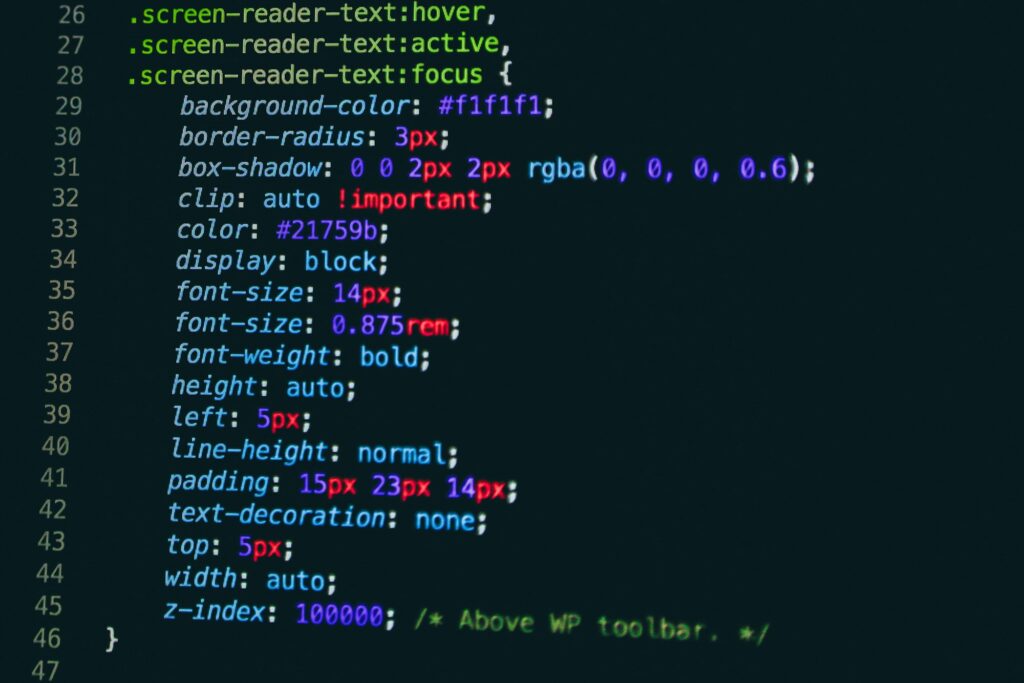
10. Accessibility Triumphs: CSS for Inclusive Design
In the digital realm of inclusivity, Accessibility Triumphs are not just victories; they’re a testament to a web that embraces all. Weaving the fabric of CSS for inclusive design is akin to building a bridge across the digital divide, ensuring that everyone, regardless of ability, can experience the web in all its multifaceted glory.
It’s a noble quest, designing with empathy as your compass, ensuring that your website isn’t just a visual feast for the eyes but a navigable haven for all. Here, CSS becomes not just a tool of aesthetics, but an instrument of empowerment. By employing strategies such as high contrast color schemes, you don’t just paint a picture; you carve a path for those with visual impairments to perceive and appreciate the digital landscape.
Consider the humble ‘font-size’. When wielded with the precision of a master calligrapher, it allows for text scaling, making reading a pleasure, not a puzzle, for those who need a little extra size. It’s a simple act, but it echoes loudly in the halls of accessibility.
And let us not forget the ‘focus’ pseudo-class, a beacon guiding the keyboard warriors through the murk of navigation. It’s a shining light that says, “Here, friend, this is where you are,” helping those who can’t rely on the aid of a mouse to interact with the digital world seamlessly.
Responsive units like ’em’ and ‘rem’ are the allies in our cause, ensuring that elements scale in harmony with user preferences, rather than dictating terms in pixels and points. They’re the building blocks of a fluid and flexible web, where the user is the maestro, and the interface responds to their baton.
ARIA (Accessible Rich Internet Applications) roles and properties come into play like a guild of craftsmen, each attribute refining the semantics of your web content, making it intelligible to assistive technologies. With the right ARIA labels, screen readers can sing the content of your pages as sweetly as a lark at dawn, making sense of menus, buttons, and sliders with ease.
In the gallant effort to make the web universally navigable, CSS’s role is undeniably pivotal. It’s the thread that stitches accessibility into the very fabric of the web, not as an afterthought, but as a cornerstone of modern web design. As we march forward into 2023, let us carry the banner of Accessibility Triumphs high and proud, crafting a web that’s not just for the few, but for everyone, a digital utopia that truly is, in every sense of the word, inclusive.
