
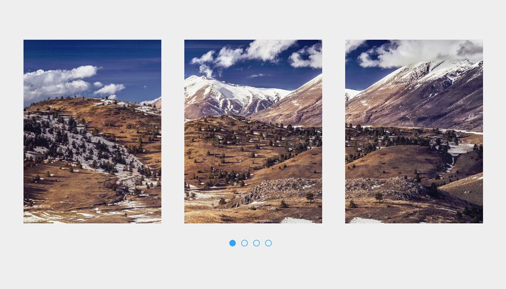
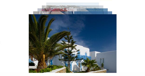
This tutorial will teach you how to create a slider divided into 3 rectangle portraits that moves independently from one another but together creates a complete picture. The perfect use of this slider is to highlight beautiful images like landscapes. I think this slider will work best with images whose elements are present all across the image like wide city photos, wide landscapes or beautiful wide architecture.
The slider features arrows controls for Next Side and Previous Slide and Bottom Navigation that displays the current slide and changes the slide when you click on a dot. You will be able to add a large number of images because the slider is designed to work with unlimited number of images. The slider has one copy of each image in every panel, all images will be summoned from "slider-panel-images" into all 3 of the panels using jQuery's append function. Images will be changed once every 10s by setInterval function in JavaScript.
Image credit goes to Daniel Zedda on Flickr. Next Slide and Previous Slide icons where created using icomoon.
This tutorial will only work on browsers that supports the most recent CSS3 features and this tutorial is not ready for production.
HTML
The html has a few main elements. The slider-panels is the one who holds up each of the three individual panels. The first panel is called id="slider-panel-left" and it holds id="slider-panel-left-carousel" which in terms holds class="slider-panel-left-carousel-tab" which holds a single image. Please note that id="slider-dots" or class="slider-panel-left-carousel-tab" or class="slider-panel-center-carousel-tab" or class="slider-panel-right-carousel-tab", as well as the image inside of it will not be present in the final demo, because it will be dynamically generated by the JavaScript in each panel based on the number of images we will add in id="slider-panel-images". This code block is designed to show how the final html will look once the JavaScript takes over.
<div id="slider">
<div id="slider-panels">
<div id="slider-panels-next"><span class="iconb" data-icon=""></span></div>
<div id="slider-panels-previous"><span class="iconb" data-icon=""></span></div>
<div id="slider-panel-images">
<img src="_assets/1.jpg" width="900" height="400" />
<img src="_assets/2.jpg" width="900" height="400" />
</div>
<div id="slider-panel-left">
<div id="slider-panel-left-carousel">
<div class="slider-panel-left-carousel-tab"><img src="_assets/1.jpg" width="900" height="400" /></div>
<div class="slider-panel-left-carousel-tab"><img src="_assets/2.jpg" width="900" height="400" /></div>
</div>
</div>
<div id="slider-panel-center">
<div id="slider-panel-center-carousel">
<div class="slider-panel-center-carousel-tab"><img src="_assets/1.jpg" width="900" height="400" /></div>
<div class="slider-panel-center-carousel-tab"><img src="_assets/2.jpg" width="900" height="400" /></div>
</div>
</div>
<div id="slider-panel-right">
<div id="slider-panel-right-carousel">
<div class="slider-panel-right-carousel-tab"><img src="_assets/1.jpg" width="900" height="400" /></div>
<div class="slider-panel-right-carousel-tab"><img src="_assets/2.jpg" width="900" height="400" /></div>
</div>
</div>
</div>
<div id="slider-dots">
<div class="slider-dot slider-dot-current"></div>
<div class="slider-dot"></div>
</div>
</div>CSS
This demo its not responsive, this is why each element has a fixed size. The first element that we will write rules for is the '#slider' div:
#slider{
	width: 1000px;
	margin-top: 200px;
	margin-right: auto;
	margin-left: auto;
}
This element will hold both the '#slider-panels' div, which will hold all 3 panels, as well as '#slider-dots', which will display the current slide and controls.
#slider-panels{
	float: left;
	height: 400px;
	width: 1000px;
	position: relative;
}
#slider-dots{
	height: 50px;
	margin-right: auto;
	margin-left: auto;
	width: 135px;
}
.slider-dot{
	float: left;
	height: 12px;
	width: 12px;
	margin-top: 36px;
	margin-right: 12px;
	-webkit-transition: background 0.5s;
	-moz-transition: background 0.5s;
	-o-transition: background 0.5s;
	transition: background 0.5s;
	-moz-border-radius: 50% 50% 50% 50%;
	-webkit-border-radius: 50% 50% 50% 50%;
	border-radius: 50% 50% 50% 50%;
	-khtml-border-radius: 50% 50% 50% 50%;
	border: 1px solid rgba(0,147,253,1);
}
.slider-dot:hover {
	background-color: rgba(0,147,253,0.5);
	cursor: pointer;
}
.slider-dot-current {
	background-color: rgba(0,147,253,0.8);
}'.slider-dot' will be replicated to create one class for each image using jquery, it also has a css3 transition added for the background when the mouse hovers to make a smoother transition. '.slider-dot-current' is the class that will be added to each div '.slider-dot' to display the current slide.
Inside '#slider-panels' we will see '#slider-panel-images', which will be the place where we will put all the images we want in the slider. Those images will need to be 900px in width and 400 in height. We will set '#slider-panel-images' to invisible because we won't use this to display our images, this is just a place to put them all together and load them later into the page.
#slider-panel-images{
	display: none;
}
Next in line are the arrows that controls the current slide '#slider-panels-next' and '#slider-panels-previous'
#slider-panels-next{
	background-color: rgba(0,147,253,0.5);
	height: 40px;
	width: 40px;
	position: absolute;
	margin-top: -20px;
	top: 50%;
	font-size: 24px;
	color: rgba(255,255,255,1);
	line-height: 40px;
	text-align: center;
	right: 0px;
	-webkit-transition: background 0.5s;
	-moz-transition: background 0.5s;
	-o-transition: background 0.5s;
	transition: background 0.5s;
	z-index: 1;
}
#slider-panels-next:hover {
	background-color: rgba(0,147,253,1);
	cursor: pointer;
}
#slider-panels-previous{
	background-color: rgba(0,147,253,0.5);
	height: 40px;
	width: 40px;
	margin-top: -20px;
	position: absolute;
	top: 50%;
	font-size: 24px;
	line-height: 40px;
	color: rgba(255,255,255,1);
	text-align: center;
	left: 0px;
	-webkit-transition: background 0.5s;
	-moz-transition: background 0.5s;
	-o-transition: background 0.5s;
	transition: background 0.5s;
	z-index: 1;
}
#slider-panels-previous:hover {
	background-color: rgba(0,147,253,1);
	cursor: pointer;
}
Both elements have transition set in order to make the background fade in smoother when you hover over them. We have finally got to the most important part of our slider, those 3 panels. The left panel is called ‘#slider-panel-left’, the center ‘#slider-panel-center’ and finally right panel ‘#slider-panel-right’.
Each panel has another div inside which will hold the images, for example the left slider has one ‘#slider-panel-left-carousel’ his position is set to absolute and we will use JavaScript to control his position inside ‘#slider-panel-left’. We are not done yet, in order to make sure our images will look good we will have to create another element ‘.slider-panel-left-carousel-tab’ inside ‘#slider-panel-left-carousel’ which we will replicate for each image. The reason I went for this approach is because we need to only show one part of the image and not all image. For example, if an image is 900px in width and 400px in height, '.slider-panel-left-carousel-tab’ will only display the left part of the image, the 300px by 400px part of the image to be more specific. The rest wil be hidden using overflow: hidden;
#slider-panel-left{
	float: left;
	height: 400px;
	width: 300px;
	overflow: hidden;
	position: relative;
}
#slider-panel-left-carousel{
	height: 400px;
	width: 0px;
	position: absolute;
	top: 0px;
	right: 0px;
}
.slider-panel-left-carousel-tab{
	float: right;
	height: 400px;
	width: 300px;
	overflow: hidden;
	text-align: left;
	position: relative;
}
.slider-panel-left-carousel-tab img {
	float: left;
	height: 400px;
	width: 900px;
	position: absolute;
	top: 0px;
	left: 0px;
}
#slider-panel-center{
	float: left;
	height: 400px;
	width: 300px;
	margin-left: 50px;
	overflow: hidden;
	position: relative;
}
#slider-panel-center-carousel{
	height: 0px;
	width: 300px;
	position: absolute;
	top: 0px;
	left: 0px;
}
.slider-panel-center-carousel-tab{
	float: left;
	height: 400px;
	width: 300px;
	overflow: hidden;
	text-align: left;
	position: relative;
}
.slider-panel-center-carousel-tab img{
	float: left;
	height: 400px;
	width: 900px;
	position: absolute;
	top: 0px;
	left: -400px;
	}
#slider-panel-right{
	float: left;
	height: 400px;
	width: 300px;
	margin-left: 50px;
	overflow: hidden;
	position: relative;
}
#slider-panel-right-carousel{
	height: 400px;
	width: 0px;
	position: absolute;
	top: 0px;
	right: 0px;
}
.slider-panel-right-carousel-tab{
	float: left;
	height: 400px;
	width: 300px;
	overflow: hidden;
	text-align: left;
	position: relative;
}
.slider-panel-right-carousel-tab img {
	float: left;
	height: 400px;
	width: 900px;
	position: absolute;
	top: 0px;
	right: 0px;
}
You will notice that I have set '#slider-panel-left-carousel' and '#slider-panel-right-carousel' width to 0px and '#slider-panel-center-carousel' height to 0px, the reason is that those values don't really matter, because they will be later set in jQuery to fit all the images.
The right and left panel will be moving horizontally - the left one will move from right to left and the right panel will move from left to right. The center panel will move vertically and not horizontally, that's why set the width and not the height, this panel will move from bottom to top.
You will ask yourself why I didn't made all the carousels to move from top to bottom or left to right and why I have used so many ID elements instead of creating 3 generic classes for all panels. The reason I chose to move the panels independently is to create a nicer transition, as for the ID vs Classes I made this decision in order to make it easier for you to identify which panel is which.
JavaScript
Let start out by setting some variables that will make youre life easier later when you want to change those numbers.
var slideTiming = 10000;
var animationTime = 500;
var controlsHideTime = 200;
var current = 1;
The ‘slideTiming’ variable will controls the time it takes before changing to the next slide, ‘animationTime’ is the animation duration between the slides, ‘controlsHideTime’ variable changes the time it takes for the next and previous buttons to hide, ‘current’ represents the current slide or the opening slide position.
Next we will take care of the arrows using jquery hover.
$("#slider-panels-next").hide();
$("#slider-panels-previous").hide();

$("#slider-panels").hover(function(){
$("#slider-panels-next").show("drop", { direction: "right" }, controlsHideTime);
$("#slider-panels-previous").show("drop", { direction: "left" }, controlsHideTime);
},function(){
$("#slider-panels-next").hide("drop", { direction: "right" }, controlsHideTime);
$("#slider-panels-previous").hide("drop", { direction: "left" }, controlsHideTime);
});
We will use check_slide() function to check the current position and animate the slider accordingly. The left panel will have it’s position animated to the right using animate function but using a negative values. The value is provided by multiplying the width of the slide with the ‘current’ variable that indicated the current slide minus 1 because we want to take into account the case where the ‘current’ will be on and the result will be 0 so the position won’t change. The same goes for the right tab but in opposite direction, with the center panel its a different story because i wanted the slide to move up and down not from side to side and we will change the top position to minus 400, the height of the panel with the ‘current’ minus 1.
The other thing that we have to do in this function is to first remove the class ‘.slider-dot-current’ from all ‘.slider-dot’ and then add ‘.slider-dot-current’ only to the appropriate position. You will see that we are using data-slide attribute in order to find the appropriate element that needs to be changed, i will talk later about this attribute.
function check_slide(){
$("#slider-panel-left-carousel").animate({"right": -(300*(current-1))}, animationTime, "easeInOutExpo");
$("#slider-panel-center-carousel").animate({"top": -(400*(current-1))}, animationTime, "easeInOutExpo");
$("#slider-panel-right-carousel").animate({"left": -(300*(current-1))}, animationTime, "easeInOutExpo");
$('.slider-dot').removeClass('slider-dot-current');
$('.slider-dot[data-slide="'+current+'"]').addClass('slider-dot-current');
}
We will now write the function that changes the slides both when you press the arrows or when the autochange function is activated this will also reset ‘current’ variable and summon check_slide(); function to change the slider.
function nextslide() {if(current==total_slides){current = 1}else{current++} check_slide();}
function previousslide() {if(current==1){current = total_slides}else{current--} check_slide();}
Lets go ahead and add controls for the arrows also:
$("#slider-panels-next").click(function() {nextslide();});
$("#slider-panels-previous").click(function() {previousslide();});
setInterval will take care of the automated slider switching:
var refreshIntervalId = setInterval(nextslide, slideTiming);In the next step we will be looping through the images located in ‘#slider-panel-images’ and append them in all of the 3 panels. We will also add the small dots at the bottom of the slider to display the current position of the slider. We are adding the attribute ‘data-slide’ to each ‘.slider-dot’ in order to identify and change the dots to display the current slide.
We will need to change the size of all 3 carousel that are filled with images. The side ones will need width adjustments and the center one will need height adjusted. We will also need to change the width ‘#slider-dots’ because it won’t stay centered if it doesn’t have a width.
var total_slides = 0;
$("#slider-panel-images img").each(function() {
total_slides++;
$("#slider-panel-left-carousel").append('<div class="slider-panel-left-carousel-tab"><img src="'+$(this).attr('src')+'" width="'+$(this).attr('width')+'" height="'+$(this).attr('height')+'" /></div>');
$("#slider-panel-center-carousel").append('<div class="slider-panel-center-carousel-tab"><img src="'+$(this).attr('src')+'" width="'+$(this).attr('width')+'" height="'+$(this).attr('height')+'" /></div>');
$("#slider-panel-right-carousel").append('<div class="slider-panel-right-carousel-tab"><img src="'+$(this).attr('src')+'" width="'+$(this).attr('width')+'" height="'+$(this).attr('height')+'" /></div>');
$("#slider-dots").append('<div class="slider-dot" data-slide="'+total_slides+'"></div>');
$("#slider-panel-left-carousel").css('width',(300*total_slides));
$("#slider-panel-right-carousel").css('width',(300*total_slides));
$("#slider-panel-center-carousel").css('height',(400*total_slides));
$("#slider-dots").css('width',(total_slides*26));
});
The last thing we have to do is change the slide when someone is clicking on ‘.slider-dot’. We will do that by setting the variable ‘current’ equal to the number inside the attribute ‘data-slide’ and by calling the function check_slide()
We will have to call the check_slide() function one more time outside the click function because we also need to check the current slide when a page loads.
$(".slider-dot").click(function() { current = $(this).attr('data-slide'); check_slide();  });

check_slide();