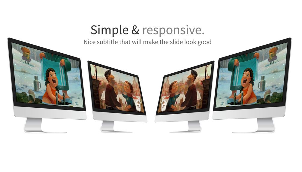
Today i will teach you how to create a tilted gallery using jQuery and using the CSS3 transform property. Each gallery features controls and popup for each picture.
This tutorial is best suited for portfolio galleries or for creating a professional photo gallery. This tutorial is made so that it will work with unlimited number of sliders, photos and on any screen size.
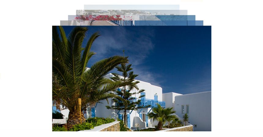
A special thanks goes to David Hauserman for allowing me to use his photos. Some of the icons where created using icomoon.
This tutorial will only work on browsers that supports the most recent CSS3 features and this tutorial is not ready for production.]
HTML
The HTML starts with id=”popup” which will display the image popup once you click on an image and the id=”wrapper” that will hold all the galleries. id=”popup” will be used to fill the entire screen with a transparent background.
<div id="popup"><div id="popup-box"><div id="popup-box-close"><span class="iconb" data-icon=""></span></div><img id="popup-box-image" /></div></div>The main element that hold the gallery is id=”wrapper”, you will find out later why is important to use this element. id=”gallery” is the element that hold all the photo galleries. In the code presented here you will find only one class=”gallery-tab” but you can add as many as you want because the javascript is created to work with an unlimited number of galleries. If you want to add multiple galleries you just have to copy the entire class=”gallery-tab” element’s content and replace the images inside. If you want to add more images you will have to copy class=”gallery-tab-images-slider-tab” multiple times because that is the element that holds the images.
<div id="wrapper"><div id="gallery"><div class="gallery-tab"><div class="gallery-tab-title"><div class="gallery-tab-title-holder"><div class="gallery-tab-title-holder-controls"><div class="gallery-tab-title-holder-controls-button previous"><span class="iconb" data-icon=""></span></div><div class="gallery-tab-title-holder-controls-button next"><span class="iconb" data-icon=""></span></div></div><div class="gallery-tab-title-holder-text">Portfolio Gallery</div></div></div><div class="gallery-tab-images"><div class="gallery-tab-images-slider"><div class="gallery-tab-images-slider-tab"><div class="gallery-tab-images-slider-tab-hover"><span class="iconb" data-icon=""></span></div><img src="_assets/1_1.jpg" /></div><div class="gallery-tab-images-slider-tab"><div class="gallery-tab-images-slider-tab-hover"><span class="iconb" data-icon=""></span></div><img src="_assets/1_2.jpg" /></div><div class="gallery-tab-images-slider-tab"><div class="gallery-tab-images-slider-tab-hover"><span class="iconb" data-icon=""></span></div><img src="_assets/1_3.jpg" /></div><div class="gallery-tab-images-slider-tab"><div class="gallery-tab-images-slider-tab-hover"><span class="iconb" data-icon=""></span></div><img src="_assets/1_4.jpg" /></div><div class="gallery-tab-images-slider-tab"><div class="gallery-tab-images-slider-tab-hover"><span class="iconb" data-icon=""></span></div><img src="_assets/1_5.jpg" /></div><div class="gallery-tab-images-slider-tab"><div class="gallery-tab-images-slider-tab-hover"><span class="iconb" data-icon=""></span></div><img src="_assets/1_6.jpg" /></div><div class="gallery-tab-images-slider-tab"><div class="gallery-tab-images-slider-tab-hover"><span class="iconb" data-icon=""></span></div><img src="_assets/1_7.jpg" /></div><div class="gallery-tab-images-slider-tab"><div class="gallery-tab-images-slider-tab-hover"><span class="iconb" data-icon=""></span></div><img src="_assets/1_8.jpg" /></div><div class="gallery-tab-images-slider-tab"><div class="gallery-tab-images-slider-tab-hover"><span class="iconb" data-icon=""></span></div><img src="_assets/1_9.jpg" /></div></div></div></div></div></div>CSS
Lets start out by styling the element #wrapper. We will make it float to the left because we want the height to be adjusted automatically and also we make it ‘overflow: hidden;’ due to the incline of the galleries it will make the width of the element bigger than the overall browser window and we don’t want to see a horizontal scrolling bar.
#wrapper { width: 100%; float: left; overflow: hidden;}The popup will have a fixed position and we will also have to set the display to none because we will make it visible only when a user clicks on a photo. #popup-box will have the position relative because we have to position #popup-box-close outside the image.
#popup { background-color: rgba(37,37,37,0.9); height: 100%; width: 100%; position: fixed; z-index: 2; display: none;}#popup-box { height: 428px; width: 640px; margin-top: 10%; margin-right: auto; margin-left: auto; position: relative;}#popup-box-close { background-color: rgba(53,117,159,1); height: 40px; width: 40px; font-size: 24px; line-height: 40px; color: rgba(255,255,255,1); text-align: center; -webkit-transition: all 0.5s; -moz-transition: all 0.5s; -o-transition: all 0.5s; transition: all 0.5s; float: left; position: absolute; top: 0px; right: -40px;}#popup-box-close:hover { background-color: rgba(63,141,191,1); cursor: pointer;}#popup-box-image { position: absolute; left: 0px; top: 0px;}Lets move on to the main element of this tutorial, #gallery. The sliders inside #gallery will be bigger than the gallery div because of the incline and that’s why we need to hide any horizontal overflow in this element. We will do that with ‘overflow-x: hidden;’. Another important point is to make the #gallery taller than it really is because the vertical scrolling bar won’t be displayed properly, we will do this using ‘padding-bottom: 300px;’
#gallery { float: left; width: 110%; overflow-x: hidden; padding-bottom: 300px;}We have used the class .gallery-tab for each slider because you will be able to insert as many sliders as you want. The only special property that .gallery-tab has is the CSS3 transform property. We will have to use the transform property to rotate .gallery-tab and we have to write it three times in different formats for all the major browsers.
.gallery-tab { float: left; width: 100%; transform: rotate(-10deg); -ms-transform: rotate(-10deg); -webkit-transform: rotate(-10deg); margin-left: -50px;}The next element its probably a bit confusing but i will hopefully clear it out for you. .gallery-tab-title is the parent for .gallery-tab-title-holder-controls and .gallery-tab-title-holder will have to be set to ‘position: relative;’ because we want to move .gallery-tab-title-holder -45px to the left.
.gallery-tab-title { float: left; width: 100%; height: 50px; -webkit-transition: all 0.5s; -moz-transition: all 0.5s; -o-transition: all 0.5s; transition: all 0.5s; margin-top: 20px; position: relative;}.gallery-tab-title-holder { float: left; height: 50px; position: absolute; left: -45px;}Inside .gallery-tab-title-holder you will find .gallery-tab-title-holder-controls and .gallery-tab-title-holder-text, .gallery-tab-title-holder-controls also has .gallery-tab-title-holder-controls-button inside.
.gallery-tab-title-holder-controls { height: 50px; float: left; -webkit-touch-callout: none; -webkit-user-select: none; -khtml-user-select: none; -moz-user-select: none; -ms-user-select: none; user-select: none;}.gallery-tab-title-holder-controls-button { float: left; height: 40px; width: 40px; text-align: center; font-size: 30px; background-color: #252525; line-height: 40px; color: rgba(243,241,233,1); margin-right: 5px; margin-top: 5px; -webkit-transition: all 0.5s; -moz-transition: all 0.5s; -o-transition: all 0.5s; transition: all 0.5s;}.gallery-tab-title-holder-controls-button:hover { background-color: rgba(63,141,191,1); cursor: pointer;}.gallery-tab-title-holder-text { float: left; height: 50px; font-weight: 300; color: #272727; font-size: 50px; line-height: 45px; margin-left: 5px;}.gallery-tab-title-holder-text:hover { color: #35759f; cursor: pointer;}The next element after .gallery-tab-title is .gallery-tab-images. Inside this one we have another div .gallery-tab-images-slider that will be used to hold images. Images are hold in tabs. Inside the tab you will also find a hover element .gallery-tab-images-slider-tab-hover that will only be shown when a user hovers above the picture. The .gallery-tab-images element needs to have a relative position because we will use this as a reference to move .gallery-tab-images-slider.
.gallery-tab-images { float: left; height: 220px; width: 100%; margin-top: 20px; overflow: hidden; position: relative; display: none;}.gallery-tab-images-slider { float: left; width: 30px; overflow: hidden; height: 220px; position: absolute;}The element .gallery-tab-images-slider-tab also needs to have a relative position because .gallery-tab-images-slider-tab-hover will be positioned above the content of this element. We will display and hide the hover icon not by using javascript but by changeling the opacity of this element.
.gallery-tab-images-slider-tab { float: left; height: 220px; margin-right: 20px; position: relative;}.gallery-tab-images-slider-tab img { height: 220px; float: left;}.gallery-tab-images-slider-tab-hover { height: 220px; background-color: rgba(63,141,191,0.5); position: absolute; left: 0px; top: 0px; color: rgba(255,255,255,1); width: 100%; font-size: 30px; line-height: 220px; text-align: center; cursor: pointer; opacity: 0; -webkit-transition: all 0.5s; -moz-transition: all 0.5s; -o-transition: all 0.5s; transition: all 0.5s;}.gallery-tab-images-slider-tab-hover:hover { opacity: 1;}JavaScript
Please note that we will have to use ‘$(window).load(function () {});’ instead of the usual ‘$(function() {});’ because we want to start after all the images are loaded, this way when we have to calculate the actual height and width of the pictures they will be displayed correctly.
We will start by creating a variable that we will use for display the transition time in milliseconds.
var animationTime = 500;The next thing we have to do is create the click function for when a user clicks on the title. When they click the arrow controls will appear from the left. If the element .gallery-tab-images is visible we will move .gallery-tab-title-holder -45 px to the left if the element is hidden we will show the controls by moving .gallery-tab-title-holder 50 px from left side. We also have to hide or show .gallery-tab-images each time they click on the title.
$('.gallery-tab-title-holder-text').click(function() { if($(this).parent().parent().next().is(":visible")){ $(this).parent().animate({"left": -45}, animationTime); }else{ $(this).parent().animate({"left": 50}, animationTime); } $(this).parent().parent().next().slideToggle(animationTime);});In order for the images to be displayed correctly we have to set the width of .gallery-tab-images-slider equal to the total widths of all the pictures plus the space between the pictures. There is a problem because all the images have a default height of 220 px set up in CSS and the pictures don’t have the final width set up in HTML, so its not possible to get he width of an image straight away. We will have to create a loop that will check each .gallery-tab-images-slider class and then create another loop inside the master loop. This final loop will take each individual image and get its default height and width to create a ratio between the two. We will have the final width by multiplying the ratio with 220 which is the height set up in CSS. Keep in mind we have to add 20 px for each picture because that is the distance between the images. We will also add two HTML5 attributes ‘data-height’ and ‘data-width’ to each image that will later help us when we use the image popup.
$('.gallery-tab-images-slider').each(function(slider_index, slider) { var total_width = 0; $(this).children('.gallery-tab-images-slider-tab').children('img').each(function(image_index, image) { $(this).attr('data-height',image.height); $(this).attr('data-width',image.width); var ratio = image.width/image.height; var actual_width = Math.round(ratio*220); total_width+= actual_width+20; }); $(this).width(total_width);});The next thing is to create functions for when a user presses one of the two buttons to move the slider. When a user presses the right arrow we will have to check if the left position value for the slider is not higher than the negative value of the slider’s width minus the width the #gallery element. If the result is TRUE we will proceed to moving the slider.
$('.next').click(function() { if($(this).parent().parent().parent().next().is(":visible")){ var this_slider = $(this).parent().parent().parent().next().children('.gallery-tab-images-slider') if((this_slider.position().left)>(-(this_slider.width()-$('#gallery').width()))){ this_slider.animate({"left": (this_slider.position().left)-329}, 200); } }});When a user presses the left button before moving the slider to the left we will have to check if the left position value for the slider is smaller than minus 200 and if the result is TRUE we will move the slider.
$('.previous').click(function() { if($(this).parent().parent().parent().next().is(":visible")){ var this_slider = $(this).parent().parent().parent().next().children('.gallery-tab-images-slider') if((this_slider.position().left)<-200){ this_slider.animate({"left": (this_slider.position().left)+300}, 200); } }});The last part of this tutorial is to teach you how the popup works. To make the popup happen we will have to create a click function. Inside the click function we will set the source of the image located inside the popup to the source of the image we have clicked on. We will also have to set its width and its height to the height and width of the image we have clicked on. If we don’t change the width of #popup-box each time we click on a different image the popup will not be centered so we will have to change the width of the box as well. The last thing we have to do is make the popup element fade in.
$(".gallery-tab-images-slider-tab-hover").click(function() { $("#popup-box-image").attr("src", $(this).next('img').attr("src")); $("#popup-box-image").css('width',$(this).next('img').attr("data-width")).css('height',$(this).next('img').attr("data-height")); $("#popup-box").css('width',$(this).next('img').attr("data-width")).css('height',$(this).next('img').attr("data-height")); $('#popup').fadeIn(200);});Last but not least we will make the popup element to fade out when we click on the close icon.
$('#popup-box-close').click(function() { $('#popup').fadeOut(200);});