
This tutorial will teach you how to create a loading header effect while you scroll. To create this we will use both jQuery and some CSS features. This tutorials has 4 examples and i will explain in detail how each works.
Loading header while you scroll it's a growing trend in the web design industry. It's a great visual way of letting users know how much more they have to read until the end of the article.
The basic effect of changing the width of a loading bar looks good but i added some more features like loading the whole header, loading only the logo and also loading the logo and the loading bar at the same time. At the time of writing there are some tutorials out there related to this matter but from what I have seen all have some sort of issues regarding the loading, like it's not loaded at 100% when you reach the end of the article or if you resize the window the loading bar doesn't move to the proper position while you resize.
HTML
There are 4 pages in this tutorial one for each example. The text part will be the same for all 4 examples and it will look like this:
<div id="article-center-text"></div>
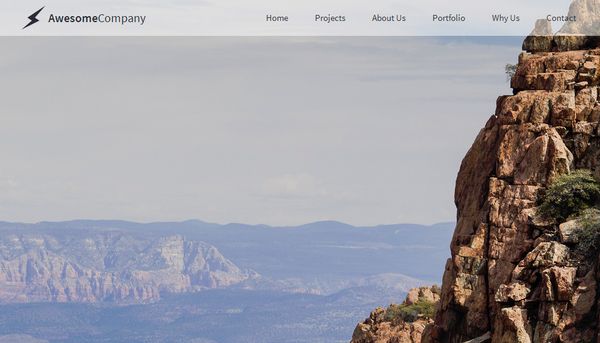
The header will be the same for examples 1,3 and 4, the second example will have a different header. This is how the header for 1,3,4 examples will look like:
<div id="header">
<div id="header-inner">
<div id="header-inner-logo">
<img src="_assets/logo.png" width="229" height="50" />
</div>
<div id="header-inner-nav">
<p><a href="index.php">Example 1</a></p>
<p><a href="example2.html">Example 2</a></p>
<p><a href="example3.html">Example 3</a></p>
<p><a href="example4.html">Example 4</a></p>
</div>
</div>
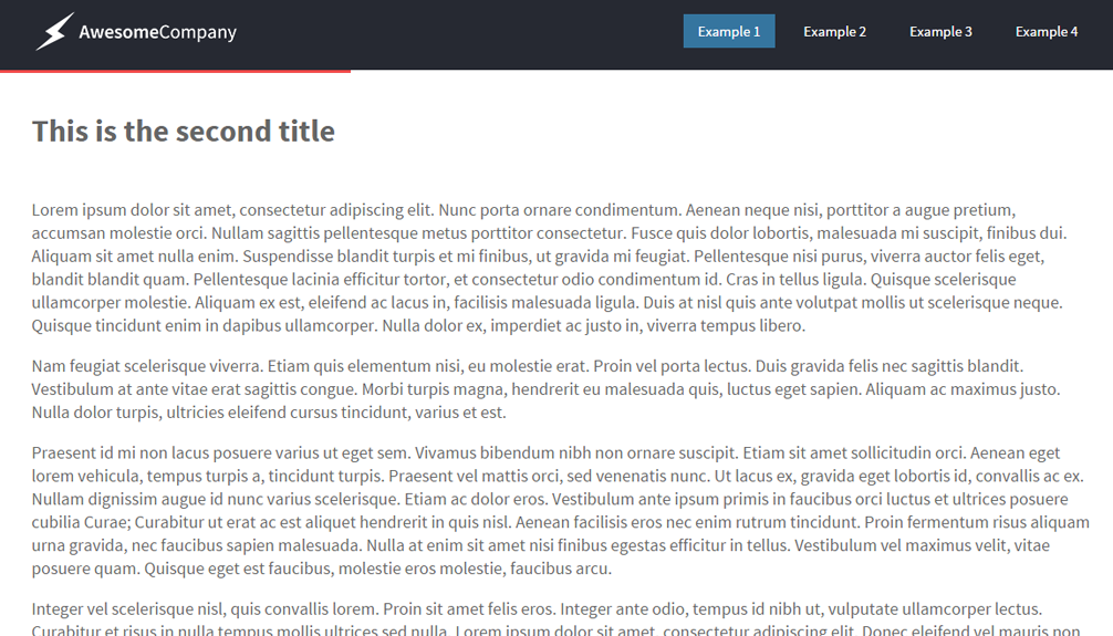
</div>This is how the header for the second example will look like:
<div id="header">
<div id="header-inner">
<div id="header-inner-logo" style="background: transparent;">
<div id="header-inner-logo-icon"><span class="iconb" data-icon=""></span></div>
<div id="header-inner-logo-text"><span>Awesome</span>Company</div></div>
<div id="header-inner-nav">
<p><a href="index.html" >Example 1</a></p>
<p><a href="example2.html">Example 2</a></p>
<p><a href="example3.html">Example 3</a></p>
<p><a href="example4.html">Example 4</a></p>
</div>
</div>
</div>As you can see the second example uses a text based logo while the other examples uses an image based logo. The image based ones are a little tricky because the logo is cutted out from from a picture and the logo cutout it's transparent, that's how we mange to create a loading logo effect. This is not the greatest implementation but i was forced to use this method instead of a moving background gradient on the text because background-clip CSS property was not properly supported by internet explorer.
CSS
The CSS for this tutorial doesn't have anything special and it will be the same for all examples.
#header{
float: left;
width: 100%;
position: fixed;
left: 0px;
top: 0px;
z-index: 1;
color: rgba(255,255,255,1);
background-color: #262932;
}
#header-inner {
width: 1100px;
height: 80px;
margin-right: auto;
margin-left: auto;
}
#header-inner-logo {
float: left;
line-height: 50px;
height: 50px;
width: 229px;
background: #FFF;
margin-top: 15px;

}
#header-inner-logo-icon {
float: left;
height: 50px;
width: 50px;
font-size: 40px;
text-align: center;
}
#header-inner-logo-text {
float: left;
height: 50px;
font-size: 20px;
}
#header-inner-logo-text span {
font-weight: 600;
}
#header-inner-nav {
float: right;
}
#header-inner-nav p {
font-size: 15px;
color: inherit;
text-decoration: none;
font-weight: 400;
display: block;
float: left;
margin-left: 15px;
-webkit-transition: all 0.5s;
-moz-transition: all 0.5s;
-o-transition: all 0.5s;
transition: all 0.5s;
line-height: 35px;
margin-bottom: 0px;
margin-top: 22px;
}
#header-inner-nav p:hover {
background-color: hsla(203,50%,50%,1);
}
#header-inner-nav p a {
color: hsla(0,0%,100%,1);
text-decoration: none;
padding-right: 15px;
padding-left: 15px;
display: block;
}
.header-inner-nav-active {
background-color: #35759F;
}
#loading {
background-color: #EF4848;
height: 3px;
width: 0px;
position: fixed;
left: 0px;
top: 80px;
}
JavaScript
Each example has it's own .js file, i will explain how each example works. The first example works by making the element "#loading" wider as you scroll down. The width of the element "#loading" will grow wider based on what percentage you scrolled of the total available scroll. How do we find out what percentage we have scrolled ? We will find this out with a simple formula, we will divide the number of pixels we have scrolled so far by the maximum possible scroll divided by 100. We get the maximum possible scroll by subtracting the window height from the document height. Finally we will use the 'scroll_percentage' variable to make the "#loading" have the necessary width. We will also put this in a function because we will activate this code when you scroll but also when you resize the window.
$(function() {

function scroll_fn(){

document_height = $(document).height();
scroll_so_far = $(window).scrollTop();
window_height = $(window).height();

max_scroll = document_height-window_height;

scroll_percentage = scroll_so_far/(max_scroll/100);

$('#loading').width(scroll_percentage + '%');

}

$(window).scroll(function() {
scroll_fn();
});

$(window).resize(function() {
scroll_fn();
});

});
The second example works by having the background of the header as a gradient and moving the colors of that gradient to different points that corresponds to the scroll percentage. I have used different gradients for different browsers.
$(function() {


function scroll_fn(){

    document_height = $(document).height();
    scroll_so_far = $(window).scrollTop();
    window_height = $(window).height();

	max_scroll = document_height-window_height;

	scroll_percentage = scroll_so_far/(max_scroll/100);

	$('#header').css({background: "-webkit-gradient(linear, left top, right top, color-stop("+scroll_percentage+"%,#ef4848), color-stop("+scroll_percentage+"%,#262932))" });
	$('#header').css({background: "-webkit-linear-gradient(left, #ef4848 "+scroll_percentage+"%,#262932 "+scroll_percentage+"%)" });
    $('#header').css({background: "-moz-linear-gradient(left, #ef4848 "+scroll_percentage+"%, #262932 "+scroll_percentage+"%)" });
	$('#header').css({background: "-o-linear-gradient(left, #ef4848 "+scroll_percentage+"%,#262932 "+scroll_percentage+"%)" });
	$('#header').css({background: "-ms-linear-gradient(left, #ef4848 "+scroll_percentage+"%,#262932 "+scroll_percentage+"%)" });
	$('#header').css({background: "linear-gradient(to right, #ef4848 "+scroll_percentage+"%,#262932 "+scroll_percentage+"%)" });
}


$(window).scroll(function() {
scroll_fn();
});

$(window).resize(function() {
scroll_fn();
});

});
The 3rd example works just like the second example only that now we are modifying the gradient background of the logo and not the whole header.
$(function() {

function scroll_fn(){

    document_height = $(document).height();
    scroll_so_far = $(window).scrollTop();
    window_height = $(window).height();

	max_scroll = document_height-window_height;

	scroll_percentage = scroll_so_far/(max_scroll/100);


$('#header-inner-logo').css({background: "-webkit-gradient(linear, left top, right top, color-stop("+scroll_percentage+"%,#ef4848), color-stop("+scroll_percentage+"%,#FFF))" });
$('#header-inner-logo').css({background: "-webkit-linear-gradient(left, #ef4848 "+scroll_percentage+"%,#FFF "+scroll_percentage+"%)" });
$('#header-inner-logo').css({background: "-moz-linear-gradient(left, #ef4848 "+scroll_percentage+"%, #FFF "+scroll_percentage+"%)" });
$('#header-inner-logo').css({background: "-o-linear-gradient(left, #ef4848 "+scroll_percentage+"%,#FFF "+scroll_percentage+"%)" });
$('#header-inner-logo').css({background: "-ms-linear-gradient(left, #ef4848 "+scroll_percentage+"%,#FFF "+scroll_percentage+"%)" });
$('#header-inner-logo').css({background: "linear-gradient(to right, #ef4848 "+scroll_percentage+"%,#FFF "+scroll_percentage+"%)" });


}


$(window).scroll(function() {
scroll_fn();
});

$(window).resize(function() {
scroll_fn();
});

});
Finally the 4th example works by modifying the width of "#loading" and making the logo load vertically instead of horizontally.
$(function() {

function scroll_fn(){

    document_height = $(document).height();
    scroll_so_far = $(window).scrollTop();
    window_height = $(window).height();

	max_scroll = document_height-window_height;

	scroll_percentage = scroll_so_far/(max_scroll/100);


$('#loading').width(scroll_percentage + '%');

$('#header-inner-logo').css({background: "-webkit-gradient(linear, left top, left bottom, color-stop("+scroll_percentage+"%,#ef4848), color-stop("+scroll_percentage+"%,#FFF))" });
$('#header-inner-logo').css({background: "-webkit-linear-gradient(top, #ef4848 "+scroll_percentage+"%,#FFF "+scroll_percentage+"%)" });
$('#header-inner-logo').css({background: "-moz-linear-gradient(top, #ef4848 "+scroll_percentage+"%, #FFF "+scroll_percentage+"%)" });
$('#header-inner-logo').css({background: "-o-linear-gradient(top, #ef4848 "+scroll_percentage+"%,#FFF "+scroll_percentage+"%)" });
$('#header-inner-logo').css({background: "-ms-linear-gradient(top, #ef4848 "+scroll_percentage+"%,#FFF "+scroll_percentage+"%)" });
$('#header-inner-logo').css({background: "linear-gradient(to top, #ef4848 "+scroll_percentage+"%,#FFF "+scroll_percentage+"%)" });


}


$(window).scroll(function() {
scroll_fn();
});

$(window).resize(function() {
scroll_fn();
});

});