
Today I will teach you how to create an animated header with scroll to a section of the page each time you click one of the links in the header. To make things a bit more interesting I also added a text heading to each section.
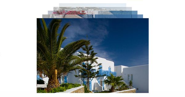
Images used in this tutorial are from Aurimas on Flickr. He has many nice photos and you should go ahead and check them out.
The scrolling technique will feel more at home in one page websites but the animated header will go great with most of the websites that have a header. To be honest I don't think there are many websites that don't have a header nowadays.
This tutorial will only work on browsers that supports the most recent CSS3 features and this tutorial is not ready for production.
HTML
Let's start out by creating a "wrapper" what will hold the whole page.
<div id="wrapper"></div>
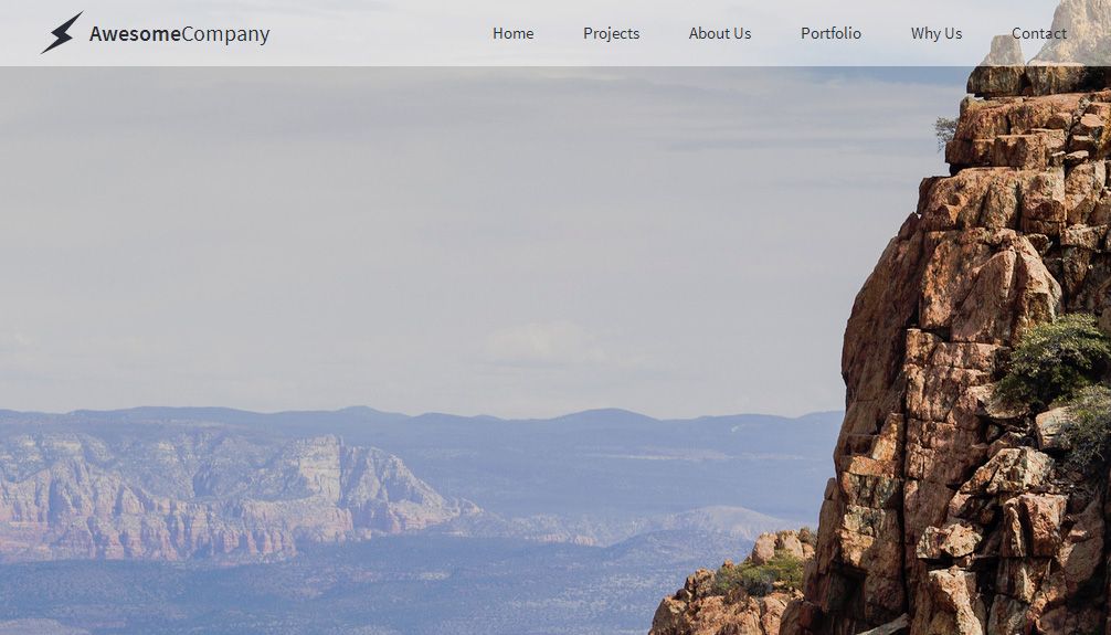
The header which is the main feature of this tutorial will have two main elements besides "header-inner" which is used to center things out. The "header-inner-logo" will be used to hold both the icon element and the text element. The navigation links are located inside "header-inner-nav". You will see that I added "data-button" attribute to each link, this attribute will help us see which link will scroll to which section.
<div id="header">
<div id="header-inner">
<div id="header-inner-logo">
<div id="header-inner-logo-icon"><span class="iconb" data-icon=""></span></div>
<div id="header-inner-logo-text"><span>Awesome</span>Company</div></div>
<div id="header-inner-nav">
<p data-button="1">Home</p>
<p data-button="2">Projects</p>
<p data-button="3">About Us</p>
<p data-button="4">Portfolio</p>
<p data-button="5">Why Us</p>
<p data-button="6">Contact</p>
</div>
</div>
</div>The sections are named "tab" and inside each tab I added an image and "tab-headline" element which also has a paragraph inside of it. You will see that all tabs have a "data-section" attribute. That is because we will use the value inside this attribute to point the header links to the right section.
<div class="tab" data-section="1">
<img src="_assets/1.jpg" />
<div class="tab-headline"><p>Home</p></div>
</div>
<div class="tab" data-section="2">
<img src="_assets/2.jpg" />
<div class="tab-headline"><p>Projects</p></div>
</div>
<div class="tab" data-section="3">
<img src="_assets/3.jpg" />
<div class="tab-headline"><p>About Us</p></div>
</div>
<div class="tab" data-section="4">
<img src="_assets/4.jpg" />
<div class="tab-headline"><p>Portfolio</p></div>
</div>
<div class="tab" data-section="5">
<img src="_assets/5.jpg" />
<div class="tab-headline"><p>Why Us</p></div>
</div>
<div class="tab" data-section="6">
<img src="_assets/6.jpg" />
<div class="tab-headline"><p>Contact</p></div>
</div>
CSS
I will start by saying that #wrapper has nothing special just floats to the left.
#wrapper {
	float: left;
	width: 100%;
}
The header will need to have it's position fixed so it can stay at the top of the screen while we scroll. The initial header doesn't have any background color, this will be set later with javascript.
#header{
	float: left;
	width: 100%;
	position: fixed;
	left: 0px;
	top: 0px;
	z-index: 1;
	color: rgba(40,43,52,1);
}
The inner header element will have to be centered and I will do that by setting his position to auto both left and right.
#header-inner {
	width: 950px;
	height: 60px;
	margin-right: auto;
	margin-left: auto;
	margin-top: 20px;
}
The left side of the header will be occupied by the logo which has two elements: the icon of the logo itself and the text. I have created two elements instead of one because I wanted to give each element different properties.
#header-inner-logo {
	float: left;
	line-height: 60px;
}
#header-inner-logo-icon {
	float: left;
	height: 60px;
	width: 50px;
	font-size: 40px;
	text-align: center;
}
#header-inner-logo-text {
	float: left;
	height: 60px;
	font-size: 20px;
}
#header-inner-logo-text span {
	font-weight: 600;
}
In the right we have the navigation which doesn't have links but paragraphs since this will be one page only. The paragraphs have a fast fade in effect when it's in hover state.
#header-inner-nav {
	float: right;
}
#header-inner-nav p {
	font-size: 15px;
	color: inherit;
	text-decoration: none;
	font-weight: 400;
	padding-left: 15px;
	display: block;
	float: left;
	margin-left: 15px;
	-webkit-transition: all 0.2s;
	-moz-transition: all 0.2s;
	-o-transition: all 0.2s;
	transition: all 0.2s;
	line-height: 35px;
	padding-right: 15px;
	margin-bottom: 0px;
	margin-top: 12px;
}
#header-inner-nav p:hover {
	color: rgba(255,255,255,1);
	background-color: hsla(225,13%,18%,1);
	cursor:pointer;
}
I wanted the sections to be the same size as the browser's window both in width and in height. For now I'm just going to set it's width to 100% because we will set the height later using javascript. You will also notice that the overflow property for the .tab class is set to hidden that's because the images will be bigger than the .tab and this will allow for some scaling overhead.
.tab {
	float: left;
	width: 100%;
	position: relative;
	overflow: hidden;
}
.tab img {
	float: left;
}
You probably wonder why I have used the '.tab-headline' elements and then putting a paragraph inside and not getting rid of '.tab-headline' all together and just using the paragraph instead. The reason I did this is because I will later need the exact width of the element so I can center it in the middle of each section. Using a paragraph would not gave me an accurate width measurement because the paragraph will also have to support the border which will get in the way of our measurements. For now we will center it approximately by setting the left and the top position to 50%. The last thing I will mention is that we need to set the position of '.tab-headline' to absolute so we can position it freely inside of '.tab'.
.tab-headline {
	position: absolute;
	left: 50%;
	top: 50%;
}
.tab-headline p {
	border: 4px solid rgba(255,255,255,1);
	font-size: 100px;
	color: rgba(255,255,255,1);
	padding-left: 30px;
	padding-right: 30px;
	font-weight: 300;
	margin: 0px;
	-webkit-transition: all 0.5s;
	-moz-transition: all 0.5s;
	-o-transition: all 0.5s;
	transition: all 0.5s;
}
.tab-headline p:hover {
	color: rgba(239,74,74,1);
	border-top-color: rgba(239,74,74,1);
	border-right-color: rgba(239,74,74,1);
	border-bottom-color: rgba(239,74,74,1);
	border-left-color: rgba(239,74,74,1);
}
JavaScript
As with most of my tutorials I am going to set two variables just in case we need to change the values later. The speed variable will be used throughout the code to set the speed for various animations. The header variable on the other hand will be used to show in which state the header is.
var speed = 500;
var header = 0;
The header animation will work like this: when a scroll is detected it will check if you are at the top of the document, if the header variable is set to 0 this means the header its in the initial position and we will have to change both the variable and the header to the other position. The first state of the header element is with the top margin set to 0 and with the background color set to white and 50% opacity, please keep in mind that the first position is when you scroll down and not when you are at the top of the document. The second position is when you are back at the top of the document and this will set the top margin to 20px and the background color is set to transparent this basically means no background color will be used.
$(window).scroll(function(){
    if($(document).scrollTop() > 0) {

	if(header == 0) {

           header = 1;
            $('#header-inner').stop().animate({ marginTop:'0px' }, speed);
	    $('#header').stop().animate({backgroundColor:'rgba(255,255,255,0.5)'}, speed);

        }

    } else {

	if(header == 1) {

           header = 0;
            $('#header-inner').stop().animate({ marginTop:'20px' },speed);
	    $('#header').stop().animate({backgroundColor:'transparent'}, speed);

        }
    }
});
The following step is to make the windows scroll to a particular section each time you click on a specific link in the header. We will do this by checking for clicks on elements that have the attribute 'data-button' attached to them. When a click its detected we will do an animated scroll by scrolling to that specific section that has the 'data-section' attribute value equal to the value of data-button' from the button that we clicked.
$('*[data-button]').click(function() {
    $('html, body').animate({
        scrollTop: $('*[data-section="'+$(this).attr('data-button')+'"]').offset().top
    }, speed);
})
The way we will resize the tabs is by setting them equal to the height of the window. To center the .tab-headline element we will have to loop trough each headline because each element will have a different width. We will center it horizontally by getting the width of the element, dividing it in half and then putting minus in front of this value that we are getting. The vertical centering its done by taking the height of the element, dividing it by 2 and also putting minus in front the the value.
All of this that I have mentioned above will sit inside a function. The reason we are doing this is because we will use this code twice: the first time is when we load the page and the second time is when re resize the window.
function resize(){

        $('.tab').height(window.innerHeight);

	$('.tab-headline').each(function(index, element) {

	$(this).css('margin-left',-$(this).width()/2);
	$(this).css('margin-top',-$(this).height()/2);

	});

	}

$( window ).resize(function() {
resize();
});

resize();